


ELI5(not so much) Linear Regression
Correlation ≠ Causation, Regression is cooler. Lazy Version


Disclaimer, I was lazy with this article but I think it covers the basics for anyone to understand what a regression is.
We often hear the phrase correlation does not equal causation. What does this mean in layman’s terms?
First of all, what is correlation? is a statistical measure that describes the degree to which two variables move in relation to each other. The most common measurement of correlation is the Pearson Correlation Coefficient. Its a mathematical operation used in the discipline of Statistics to determine linear correlation. This is a standardized version of the covariance, which gives us one part of the correlation puzzle: direction. But, magnitude (the second part) is less intuitive to understand in covariance. The Pearson Coefficient needs data grouped into pairs (EG height&weight, temperature&humidity, interestrate&stocks) and determines if there is a relationship between them and how strong it is.
But all this math can still be confusing for most, so lets explain by example. Lets say that we want to analyze temperature vs. incidences of Flu cases in the US. These two will be our variables: T = Average monthly temperature, F = New Flu cases per month. Intuitively we can infer that the lower the temperature, the higher the number of cases we will observe, so lets look at data given by GPT4o (not sure if its real but the flu cases site is a drag):
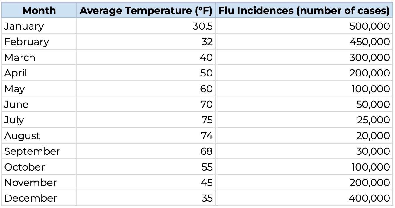
At plain sight, it looks like there is some sort of relationship (or fake relationship), as temperatures increase the cases decrease and viceversa. Now, lets see how to interpret the Pearson Correlation Coefficient’s results:

When the coefficient is close to 1 or -1, its suggesting a very strong relationship. At 1, when temperature increases, flu cases will also increase, also called a direct relationship or positive correlation. Vice versa, if it approximates -1 the strong suggestion would be that when temperature increases Flu cases will decrease, called an inverse relationship or negative correlation.
When correlation coefficient is zero the math is telling us that there is strong evidence to say that changes in one variable will not predict a change in the other. The closer to zero the less evidence there is to claim a relationship.
Always remember that these interpretations can only be as good as the data and models behind them, so they can be misleading if not used properly. In our case, we trusted GPT4o, which we should not have done, because the data looks way too perfect to be true. But we are talking theory so its not so bad. So how does temperature and flu cases relate:
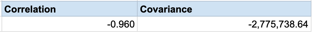
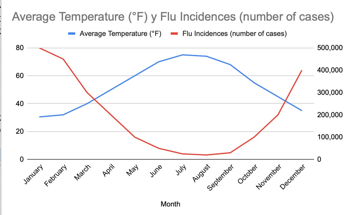
A -0.96 Correlation is an example of extremely strong inverse relationship, meaning that low temperatures are very strongly associated with rises in flu cases an viceversa. In the graph below we can see how they basically horizontally mirror each other.
These data points seem to be suggesting that cold = sick. This is not true. Setting aside GPT4o’s alleged deception (that lying piece of dirt), we do know temperature and flu cases are negatively correlated. The cold alone is not enough to get us sick. Imagine we enter a refrigerator or a cold plunge, this alone would not make us sick. Virus and bacteria cause sickness, so why do we see correlation?
Most Bacteria and Viruses are unlikely to survive in high temperatures, these are why we get fevers. If its cold outside it is more likely that viruses will survive for longer and bacteria colonies will grow, if there is more virus and bacteria in the environment, the likelihood of coming in contact with them is higher.
People remain in-doors in cold climates, which gets them physically closer to each other, making it more likely that they will transmit infections
The cold makes people cough and secrete more fluids because it irritates the respiratory ways, which enhances the probabilities of contagion by exchange of fluids, especially indoors.
Cold temperatures, according to studies, can weaken immune responses to viruses making us more susceptible to getting sick.
In layman’s terms, cold is not the cause of Flu sickness, bacteria and viruses cause sickness. Cold temperatures just foster an environment where the Flu virus thrives and is able to infect more people at a faster rate. So if your grandma tells you to wear a jacket because its cold, tell her to get real, study some statistical analysis and head to US congress because tax bills will not pass themselves.

Why does this matter to regressions?
Human Beings are terrible at making predictions, I used to have this microeconomics professor that told us Human beings are natural born conspiracy theorists. Why? because we are creatures of instinct, early humans could not afford to gather representative samples of the world and its dangers before getting eaten by a tiger or falling into some ditch, so we evolved to arrive to conclusions with very little data, making us very likely to find trends and patterns where they aren’t any. Or miss ones that do exist. Below is a great video by VSauce getting deeper into this:
We are still, to this day, really bad at predicting, but at least we have more sophisticated methods of being wrong, and we wont give up on trying to predict the future. Statistics and probability just try to help us be less bad at it, but not for the guy below.

Correlation is a very simple way to see if there is a potential relationship between two sets of data measuring a phenomena. But there is a better way in which people try to predict the future, meaning trying to find something that is likely to predict the outcome of some other thing. This better way was created by combining economics, probability, linear algebra, calculous and statistics to create a Regression Analysis in an attempt to accurately predict future events using historical data and reliably predictable elements.
Regression Analysis
Regression Analysis is a broad term. For the purposes of this article we can narrow things down to Linear Regression. The most intuitive way to explain this is to start from a scatter plot.
Lets look at the below chart, a-priori, it is reasonable to assume that when the US economy grows => public companies tend to be growing => stock indices increase in price. So our thesis for creating a regression will be: GDP changes can predict the S&P500 prices. Below is a real life example of quarterly US GDP vs S&P500 data 2018Q1-2022Q4. These data pairs rendered a 0.3 correlation coefficient. Meaning that they appear to have a, not so strong, direct linear relationship. From this we can infer that there will be some type of predicting power, but the Regression will give us much more insight into it. This is actual data, I did got these because they were more accessible.

The regression model takes this data and creates an equation that will be adjusted based on the scatter points. The objective is to use calculous in an attempt to ensure that the sum of the squares of the distance of each point to the equation is the lowest possible. (WTF?)
In simpler terms, an equation that can use one variable to predict another variable with the least amount of error mathematically possible from the available data.
We get to the minimum error possible by going back to the historical data, after getting an equation, and see how the newly created equation would have predicted values that we actually know resulted true in the past. The great thing about Calculous is that it does this automatically and gives us the equation that has the least amount of error from the get-go.
After this, we can get the actual level of minimum possible errors by subtracting the predicted value from the observed historical value, these errors are really important to assessing the precision of the regression model.
So how does this line look? the most simple regression to explain is a line. The generalized mathematical expression for a line is
m is the slope of the line, b is the Y value at which the line crosses the Y-Axis, called the Y-Intercept, X is the input and Y is the result. Adapting this to our example, lets say that we want to use the US GDP as a way to predict the prices on the stock market, we can rewrite this expression as:
Where SPY = the S&P500 price (VWAP), GDP is the US GDP, B0 is the Y intercept and B1 is the slope of the line.
So the regression analysis steps go like this, in concrete:
We find two, or more, variables that we believe to be related: 1) A response variable, this is the thing that we are trying to predict, in our case we want to predict stock market prices, hence SPY is the response variable in our example; 2) A single or multiple explanatory variables, these are variables for which we expect to see a strong relationship with the response variable, meaning the explanatory variables can explain a change in the response variable.
We gather data on all variables,
The changes in one set of data have to correspond in date and time to the changes in other sets. For example, I cannot do this analysis using 2001 SPY prices vs 2005 GDP values because I want to know how Y reactor to a specific change in X, not a similar change, but an exact change that happened under the same conditions. I cannot assess height vs weight if im not pairing the heights and weights of the same person, if I have them mixed up (weight of john and height of joe) I will not be able to isolate the effects of one on the other properly.
We create the calculous minimization model to find the minimum possible error, this looks like below. A key thing about Linear regression is that we are trying to find the B1 and B0, or the slope of the curve and the y-intercept, that minimize the error between the estimation and the actual data. We do this process by the calculous mantra, derive and equal to zero. (What we get from this equation is B1 and B0. Also, regressions can only be linear if B1 and B0 are linear expressions.)
\(\min_{B_0, B_1} \sum_{i=1}^n \left( \text{SPY}_i - (B_0 + B_1 \cdot \text{GDP}_i) \right)^2 \)Once we get B0 and B1 from the minimization problem we create an equation line, in our case that equation looks like below, with B0=-2087 and B1=.275, and we can superimpose the line graph on top of the scatter points to see how they visually relate to each other:
\(\text{SPY} = -2087 + 0.275 \cdot \text{GDP} \)

Now we have made a regression, we have created an equation that will try to predict the price of SPY using GDP, we just plug in our GDP number and we will get an estimate of stock prices. Easy, right? well, actually, not so much. What comes nexts is the testing of the model.
Assumptions, Adjustments & Tests:
In order to create a regression analysis that works there are several mathematical assumptions that we made for the model and we need to corroborate that these assumptions hold under our current conditions. Additionally, there are tests that we can perform on the regression in order to understand how good is it, a regression can be useless even if all assumptions hold.
Assumptions are very technical but can be found here. So we are just going to focus on the most important tests and indicators that we should look for to test how good of an oracle our regression is:
Linearity Assumption: we have to assess if the model is linear with a linearity test, these include ANOVA tests, Ramsay Reset tests, etc.
Our regression does not appear to show a smooth linear relationship, correlation is weak and the scatter plot is, scattered (jeje). These tests are complicated. If the relationship between variables is not linear it would be best to use a non-linear regression.
R² Test: The r-squared measures how much of the variability of the Y variable is statistically explained by the model. R² goes from 0 to 1 the higher the better. When using multiple explanatory variables the adjusted R² is a really important indicator as well.
In our example we get an R²=.0953 which means that only 9.53% of the variability in the stock market can be explained by our model. This is very low. Right out of the bat this model is unlikely to be good at predicting prices
P-Values Test: They use statistical significance tests to determine how likely is it that each explanatory variable to be significant to predicting the response variable’s change. Normally, when P-Values<0.05 means that the relationship between the predictor and the predicted values is likely to be significant.
Our GDP predictor has a P-value of 18.54%>5% meaning it is not statistically significant. In other words, the P-Value tells us if a predictor is good or not good at predicting what we want.
F-Test: The Fisher’s F test tells us how likely is for at least one predictor in the model to have a significant relationship with the predicted value. We should use a table to determine the results of this test
In our case the F-Test result is 1.89 and the critical value is 4.4, meaning that our model is not statistically significant, but we already knew that from the P-value test. Our model is not good at predicting the stock market
Residual Normality Assumption: The model is precise when the residuals (remember residual errors?) are normally distributed, for that we can plot a Q-Q plot and if we see that the points align with the normal line, especially at the middle, then its normally distributed:
For our regression here is the Q-Q plot, we can see that the dots do follow sort of a Sine function pattern, which is likely to mean that the distribution is fat tailed and not normal. This gives us all sorts of problems with the precision of the regression and the tests. This can be fixed with a transformation of the dependent variable

Homoscedasticity Assumption: The variance of all errors is the same. We have to perform a test to confirm this, if this is not the case the model becomes invalid.
We do this through the Breuch-Pagan analysis, this is a complicated test and we can avoid it for this particular exercise given that the regression has all sorts of problems anyway.
Autocorrelation of Residuals Assumption: That residuals are not correlated with each other. This, as well, can cause lots of problems if it doesen’t hold in model. To test for this we can use the Durbin-Watson test, plotting the errors, Breuch-Godfrey Test, etc.
Our model seems to be positively autocorrelated given the distribution of errors in time. Errors should appear totally random in their magnitude and direction. ADDITIONALLY: in finance, some models are purposefully made autoregressive/autocorrelated as a way to explain volatility or cyclicality

Multicollinearity: This is an issue that appears when two predictors are highly correlated with each other, each additional predictor makes the model more complicated and, the less, the better. There are many tests for this, VIF, Correlation Matrix, etc.
In our model we only have 1 predictor so this is not necessary. If we had a multicollinearity problem we could fix through: increasing sample size, regularization, combining variables, choosing one over another, centering, etc.


These 8 are the most important tests to submit your model to in order to determine how good is it. Our model is not great at all. But once a model is well adjusted we can start to do all kinds of things with it. A bad model helps us understand why all these tests are necessary. A good model will help us see what these regressions can do.
A good regression:
Lets go back to the new Flu cases vs. Temperature example. (AGAIN, MADE BY GPT4o, I was too lazy to draw them out). We know that data has a very strong inverse relationship. So lets explore it in more detail. For starters, the Pearson Correlation Coefficient for this data comes in at -0.99, suggesting an extremely strong inverse relationship. Now, After plotting the chart, we can instantly see how the data is very tightly aligned in a straight line with a downwards slope. And we are going to use the climatological temperature estimates, which have been historically accurate, to predict the cases of Flu. So now we have something that is already predicted with accuracy (temperature) and we are going to use that to predict other thing with accuracy (Flu cases)

Doing the derivation, we get the following predictive equation, where F is the number of positive Flu tests and T is the temperature:
Now that we have the model, lets look at the overlay of data vs the equation:

Lets understand the equation more in depth. This is telling us that when the temperature T = 0 the number of cases will approximate 351K. There is a problem with this equation, whenever we get to very high average temperatures, the Flu cases become negative, which is not possible. Now, another particularity for this model is that there is a floor for how cold its physically possible to get, at absolute zero around -459F. But, for the sake of simplicity, we are just going to go with this model and asume that incredibly high or low average temperatures are going to be rare.
Moreover, the model tells us that every Fahrenheit degree of temperature that increases, the Flu cases decrease by 4,650.
For this model, we get the following test results:
the R² = 0.986 meaning that the model can explain 98.6% of the change in Flu cases in the US, quite higher than our S&P500 model. ✓
The P-Values for my slope and intercept are near zero, meaning they appear to be good predictors of Flu cases. ✓
The F-test is passed with flying colors, just a redundancy confirming the P-value’s conclusion. ✓
The Durbin-Watson test also passes, meaning that there is no Autocorrelation of residuals. ✓
VIF test for Multicollinearity, despite being trivial because we only have 1 regressor (predictor), comes out good. There is no Multicolinearity. ✓
Breuch-Pagan test also passes, meaning that residuals are Homocedastic. ✓
But, there is a problem. Errors are not Normally distributed, they appear to have larger standard deviation than they should

Why? Well, we were assuming that a decrease in 1 degree would increase illness in the constant amount of about 4.6 cases, but sickness contagion is exponential. So the more people get sick, the higher the contagion odds. So lets model this, as said above, we can apply a transformation to the equation and it would look like this:
This model would not work in reality because it would not be defined for negative temperatures. But we are using fake data (probably) anyways so go with it, I already told you I was lazy anyways.

R2 is 98.2%, F-test passes, P-values pass, no multicolinearity, no autorecorrelation, no multicolinearity and homocedastic. And now, it passes the D’agostino and Anderson-Darling test, showing we dealt, at least to an extent, with the non-normality of residuals. If we look at the graph below, the LN line is tighter together with the blue line of observations, especially in the extremes as opposed to the green linear model. Meaning we have achieved a more well adjusted model by fixing one of the failed tests.

Now lets put the cherry on top in the form of a trust interval for the predictions. Below we can see the observed values, the predicted values, and the trust interval for a 95% trust rating. Meaning that we are 95% confident that observed values will fall inside that interval. The predicted value is the average. (FROM THE GPT DATA)

After looking at the data, only 1/24 observations fell outside the interval, meaning 95.8% of observed data fell inside the trust interval, which is what we expected. Moreover, when one observed value fell outside the trust interval, the difference was 0.42% with the upper limit. And here we are only using one predictive variable. We could add: co-morbidity rates, endemic presence of more or less contagious pathogens, differences by regions, etc, etc, etc. To make a much more complete model where we try to compile all the most important factors that contribute to increases in sickness. The possibilities are endless, but the simpler the model the better, if you can predict with 3 variables instead of 10 you should do that. 80 - 20 is a great philosophy for making models in general.
And what would we use this for? Well, virology is a very important systemic issue for countries, being able to predict illness rates helps the system be prepared in all kinds of areas like:
Healthcare preemptive actions
Pharmaceutical inventory forecasts
GDP, Finance and Insurance metrics
Public healthcare expenditure
Etc…
Lets return now to the causality question. Above we said and detailed that Temperature is not directly causal to sickness, but it can work as a proxy for the underlying real causes, making it a good predictor of Flu cases.
Real life examples:
In finance, economics, virology, sociology, etc. researchers use regression models and other statistical tricks to predict future outcomes. Below are some examples of regressions and predictions made by the pros and not some guy in his living room wearing a Lightning McQueen trucker hat, who can’t even use RStudio properly, AKA me.

Banxico GDP growth regression:

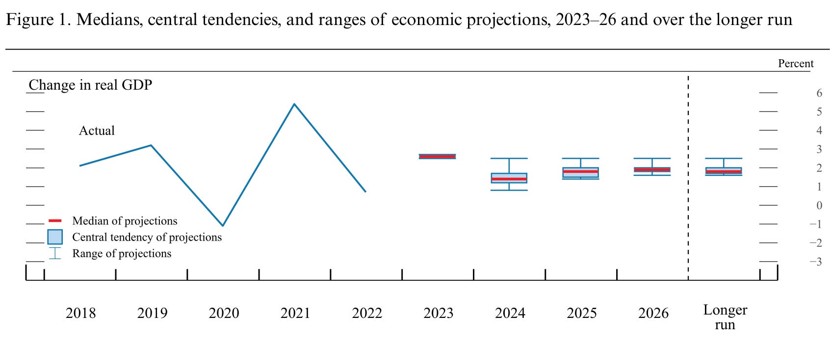
The FED’s Economic Projections:
The European Central Bank’s inflation projections:

Additionally we can find regression models in: social media algorithms, target adds, insurance, credit risk analysis, betting, etc. So this is a pretty prominent part of modern life that no much people are really aware of how it works. It helps us isolate the effect of one variable relative to another (Ex. Divorce rates from religious background) it helps us understand if there is a structural difference accross economies in an effect or between time periods (ex. How sensitive were stocks to interest rates now vs. in the 80s), etc.
If you want to create your own regression this guy can teach you how to do an easy one in exel:
Conclusion:
This is the essence of the regression. Yes, it is not as accurate as we wish it would be, but even a close enough prediction is extremely helpful. Many people mock the precision of economists predictions, the reality is that having some sort of an idea of what lies ahead gives certainty to the system and certainty is rewarded with more rational movements of actors. This promotes peace, stability, innovation and growth.
Overall, there are things that are much easier to predict than others, there are things easy to predict so we don’t even notice we do it anymore and there are things that are so hard to predict that people have just given up on it. Whatever the case may be, trying matters. Daring to give an opinion on what might be is a really important service to mankind. Wether it comes from non-technical visionaries or from very gifted academics, offering a grain of salt to help people prepare for future scenarios is not trivial, its key to the stability of our systems and the future of humanity.
 | A guest post by
|